
สอนเขียน Prompt สร้างโลโก้แบรนด์สุดหรู ด้วย AI (เคส i-Siam)
เรียนรู้วิธีเขียน Prompt สำหรับ Gemini AI เพื่อสร้างโลโก้แบรนด์ "i-Siam" สุดหรู ผสมผสานความมินิมอลและเอกลักษณ์ความเป็นไทยอย่างลงตัว บทความนี้จะสอนทุกขั้นตอนการบรรยายรายละเอียด ตั้งแต่แนวคิด ฟอนต์ การผสานสัญลักษณ์ และการเลือกใช้สี เพื่อให้คุณได้ผลลัพธ์โลโก้ระดับมืออาชีพไปใช้งานได้ทันที
AI PROMPT: BUSINESS LOGO
Admin
9/21/20253 min read
ขั้นตอนที่ 1: กำหนดแนวคิดหลัก (Core Concept)
เริ่มต้นด้วยการอธิบายภาพรวมและหัวใจของแบรนด์ที่เราต้องการสื่อสารออกไปให้ชัดเจนที่สุด
Prompt: Concept: A sophisticated wordmark that subtly integrates a traditional Thai element. The core idea is to show a blend of natural ingredients with artisanal care, represented by a delicate, almost "growing" element within the typography.
ทำไมต้องเขียนแบบนี้?
A sophisticated wordmark: ระบุประเภทของโลโก้ไปเลยว่าต้องการแบบ "Wordmark" (โลโก้ที่เป็นตัวอักษร) และต้องการอารมณ์ที่ "Sophisticated" (หรูหรา, ประณีต)
subtly integrates a traditional Thai element: บอกใบ้ถึงสไตล์ที่ต้องการ คือมีความเป็นไทย แต่ต้อง "subtly" (แฝงอยู่อย่างแนบเนียน) ไม่ใช่ตะโกนออกมา
blend of natural ingredients with artisanal care: คือการบอก "เรื่องราว" ของแบรนด์ ซึ่งจะช่วยให้ AI เข้าใจและสร้างภาพที่สื่อความหมายได้ลึกซึ้งยิ่งขึ้น
ขั้นตอนที่ 2: เจาะลึกรายละเอียดขององค์ประกอบ (Key Elements)
หลังจากมีแนวคิดหลักแล้ว ก็ถึงเวลาลงรายละเอียดทีละส่วนให้คมชัดที่สุด
ส่วนที่ 2.1: Wordmark และ Font
Prompt: Wordmark "i-Siam": Font: A custom-designed, elegant sans-serif font with subtle curves and slightly varying line weights to give it a unique, handcrafted feel without being overly rustic. It should feel clean, approachable, yet premium.
ทำไมต้องเขียนแบบนี้?
"i-Siam": ระบุชื่อแบรนด์ที่ต้องการในเครื่องหมายคำพูด
elegant sans-serif font: บอกประเภทฟอนต์ (ไม่มีเชิง) และสไตล์ที่ต้องการ (สง่างาม)
subtle curves and slightly varying line weights: อธิบายลักษณะเฉพาะของเส้นสายฟอนต์ที่อยากได้ เพื่อให้ดูมีมิติและไม่แข็งทื่อ
unique, handcrafted feel without being overly rustic: ใช้คำคุณศัพท์เพื่อกำหนดอารมณ์ของฟอนต์ ให้ความรู้สึกเหมือนงานทำมือ แต่ยังคงความพรีเมียม ไม่ดูบ้านๆ เกินไป
ส่วนที่ 2.2: การผสานสัญลักษณ์ (Integration)
นี่คือส่วนที่สำคัญที่สุดในการสร้างเอกลักษณ์ให้กับโลโก้
Prompt: Integration: The dot of the 'i' will be subtly transformed into a stylized, abstract representation of a budding botanical element – perhaps a simplified jasmine bud or a small, elegant leaf shape. This element will have a very clean, refined line art style, connecting it to nature and the "handmade" aspect.
ทำไมต้องเขียนแบบนี้?
The dot of the 'i' will be subtly transformed: ชี้เฉพาะเจาะจงลงไปเลยว่าจะ "เล่น" กับส่วนไหนของตัวอักษร
stylized, abstract representation of a budding botanical element: อธิบายว่าต้องการให้จุดนั้นกลายเป็นอะไร (องค์ประกอบของพืชที่กำลังผลิบาน) ในรูปแบบไหน (ภาพวาดสไตล์นามธรรม) เพื่อให้ AI มีอิสระในการสร้างสรรค์แต่ยังอยู่ในกรอบ
simplified jasmine bud or a small, elegant leaf shape: ยกตัวอย่างให้ AI เห็นภาพชัดขึ้น
clean, refined line art style: กำหนดสไตล์ของลายเส้นที่ต้องการ เพื่อควบคุมความมินิมอลของดีไซน์
ส่วนที่ 2.3: การเลือกใช้สี (Color Palette)
สีเป็นตัวกำหนดอารมณ์ของแบรนด์ได้ดีที่สุด ควรระบุให้ชัดเจน
Prompt:
Primary: A sophisticated, deep forest green or a rich, earthy olive green, symbolizing natural ingredients and growth.
Secondary/Accent: A soft, muted gold or a warm, creamy beige, representing luxury...
Background: A clean, slightly off-white or light cream background to ensure clarity and elegance...
ทำไมต้องเขียนแบบนี้?
แบ่งสีเป็น Primary, Secondary, และ Background เพื่อให้ AI รู้ว่าสีไหนควรใช้กับส่วนประกอบใด
ใช้ชื่อสีที่เฉพาะเจาะจง (เช่น deep forest green, muted gold) พร้อมอธิบายความหมายที่ต้องการจะสื่อ (symbolizing natural ingredients, representing luxury) จะช่วยให้ AI เลือกเฉดสีได้ตรงใจมากยิ่งขึ้น
ขั้นตอนที่ 3: สรุปอารมณ์โดยรวม (Overall Feel)
ปิดท้ายด้วยการสรุป Mood & Tone ทั้งหมดอีกครั้งด้วยคีย์เวิร์ดสั้นๆ แต่ทรงพลัง เพื่อตอกย้ำทิศทางของดีไซน์
Prompt:
Minimalist & Modern: Clean lines, uncluttered design.
Artisanal & Authentic: The custom font and subtle botanical element hint at handmade quality and natural origins.
Thai Identity: The specific botanical choice can subtly reference Thai flora without being overtly literal or cliché.
Memorable: Simple shapes and unique typography make it easy to recall.
ทำไมต้องเขียนแบบนี้? เป็นการรวบตึงทุกอย่างเข้าด้วยกัน เพื่อให้ AI ตรวจสอบอีกครั้งว่าผลลัพธ์สุดท้ายควรมีอารมณ์และความรู้สึกไปในทิศทางไหน
เมื่อนำ Prompt ทั้งหมดมารวมกัน เราก็จะได้โลโก้ "i-Siam" ที่สวยงามและตรงตามโจทย์ทุกประการ ลองนำเทคนิคเหล่านี้ไปปรับใช้กับการสร้างโลโก้สำหรับแบรนด์ของคุณดูสิคะ!
เคยไหมที่อยากได้โลโก้สวยๆ สำหรับแบรนด์ แต่ไม่รู้จะเริ่มต้นอย่างไร? วันนี้ AiPromptSpark จะมาแชร์เคล็ดลับการเขียน Prompt ให้กับ Gemini AI เพื่อสร้างสรรค์โลโก้ที่มีเอกลักษณ์ สวยงาม และสื่อถึงตัวตนของแบรนด์ได้อย่างมืออาชีพ โดยเราจะใช้เคสตัวอย่างของแบรนด์ "i-Siam" ที่ต้องการความรู้สึกหรูหรา ผสมผสานธรรมชาติ และกลิ่นอายความเป็นไทยในสไตล์โมเดิร์น
หัวใจสำคัญของการได้ภาพที่ตรงใจ คือการเขียน Prompt ที่ "ละเอียด" และ "ชัดเจน" เหมือนเรากำลังบรีฟงานกราฟิกดีไซเนอร์มืออาชีพคนหนึ่ง มาดูกันเลยว่าเราจะแปลงแนวคิดให้กลายเป็น Prompt ที่สมบูรณ์ได้อย่างไร
Generate company logo as description below
Concept: A sophisticated wordmark that subtly integrates a traditional Thai element. The core idea is to show a blend of natural ingredients with artisanal care, represented by a delicate, almost "growing" element within the typography.
Key Elements:
Wordmark "i-Siam":
Font: A custom-designed, elegant sans-serif font with subtle curves and slightly varying line weights to give it a unique, handcrafted feel without being overly rustic. It should feel clean, approachable, yet premium.
Integration: The dot of the 'i' will be subtly transformed into a stylized, abstract representation of a budding botanical element – perhaps a simplified jasmine bud or a small, elegant leaf shape. This element will have a very clean, refined line art style, connecting it to nature and the "handmade" aspect.
Connection: The botanical dot will appear as if it's naturally unfurling or releasing fragrance, emphasizing the perfume aspect.
Color Palette:
Primary: A sophisticated, deep forest green or a rich, earthy olive green, symbolizing natural ingredients and growth.
Secondary/Accent: A soft, muted gold or a warm, creamy beige, representing luxury, the preciousness of your ingredients, and a touch of traditional Thai artistry. This can be used for the botanical element or as a subtle highlight.
Background: A clean, slightly off-white or light cream background to ensure clarity and elegance, making the green and gold truly pop.
Overall Feel:
Minimalist & Modern: Clean lines, uncluttered design.
Artisanal & Authentic: The custom font and subtle botanical element hint at handmade quality and natural origins.
Thai Identity: The specific botanical choice can subtly reference Thai flora without being overtly literal or cliché.
Memorable: Simple shapes and unique typography make it easy to recall.
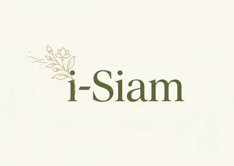
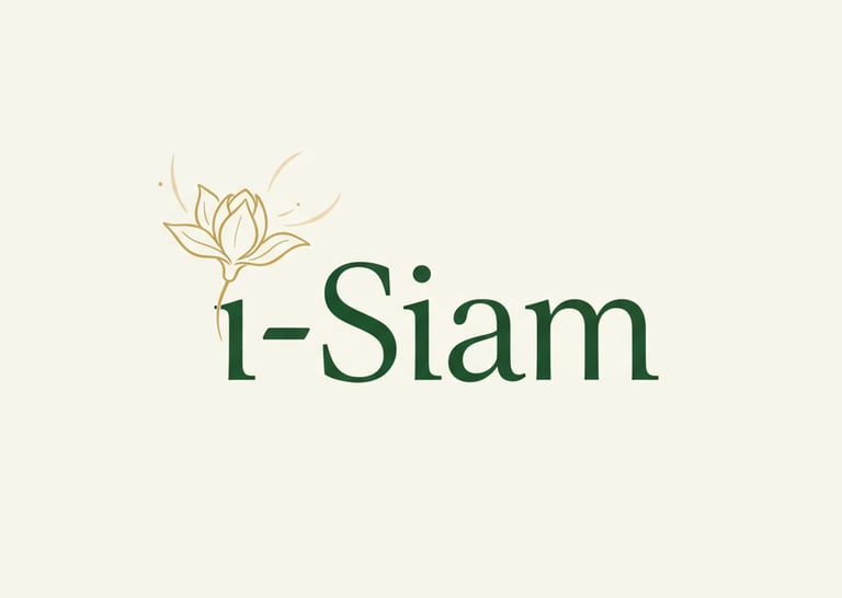
Logo ที่สร้างจาก Gemini Prompt
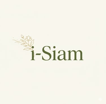
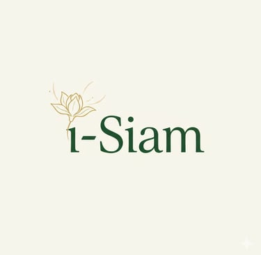
Logo ที่สร้างจาก Gemini Prompt